by Dave Senf
March 2019
Transfer payments are trending up in Minnesota due to an aging population and expanding programs.
Ever wonder where all the money goes now that the national debt has surpassed the $22 trillion mark? Or where the increasing Social Security spending – projected in the mid-2030s to trigger reduced benefits unless Congress takes action to shore up the program’s finances – ends up? Where does the mounting Medicare and Medicaid money get spent? Or where Supplemental Nutrition Assistance Program (SNAP) benefits, Earned Income Tax Credit (EITC) benefits, or Veterans’ benefits are received and spent? Answers to questions like these can be found in current transfer payments data produced by the Bureau of Economic Analysis (BEA) as part of their personal income estimations.
BEA estimates of personal income and its components, for states, counties, and metro areas, are widely used to compare economic well-being across areas and to track economic progress over time. For example, Minnesota’s per capita personal income ranking over the last 20 years has ranged from a high of 11th in 2004 to 17th highest in 2006. The state ranked 14th in per capita income in 2017 matching its average ranking between 1998 and 2017.
There are three main components of BEA’s personal income measure – earnings related to work, earnings received by individuals in the form of dividends, interest, and rents (DIR), and transfer payments. Transfer payments consist of a variety of payments to individuals and nonprofit institutions by federal, state, and local governments and by business. Unlike work-related earnings and DIR income, transfer payments are made with no current or future goods or services required in return. Table 1 lists the three personal income components for the U.S. and Minnesota along with their per capita estimates for 2017.
Minnesota’s personal income in 2017 was estimated at $303.1 billion or 1.80 percent of total U.S. personal income of $16.8 trillion. Minnesota earned 1.86 percent of the nation’s earnings from work and a slightly lower share, 1.74 percent of the nation’s dividend, interest, and rent income. Minnesota received 1.66 percent of national transfer payments which was lower than the state’s 1.71 percent of U.S. population. On a per capita basis, Minnesota’s three major components of personal income combined ended up being 5.27 percent higher than U.S. per capita personal income, $54,359 compared to $51,640 in 2017. Minnesota per capita work earnings were 8.65 percent above the U.S., per capita dividends, interest, and rent earnings were 1.80 percent higher, while per capita transfer receipts were 3.23 percent less than the U.S. average (Table 1).
| Table 1. Personal Income Major Components, 2017 | |||
|---|---|---|---|
| Total | U.S. | MN | Minnesota Percent of U.S. |
| Personal income (billions) | 16,820.3 | 303.1 | 1.80 |
| Net earnings by place of residence | 10,603.7 | 197.3 | 1.86 |
| Dividends, interest, and rent | 3,356.9 | 58.5 | 1.74 |
| Personal current transfer receipts | 2,859.6 | 47.4 | 1.66 |
| Population (millions) | 325.7 | 5.6 | 1.71 |
| Per Capita | |||
| Personal income | 51,640 | 54,359 | 5.27 |
| Source: Bureau of Economic Analysis (BEA) | |||
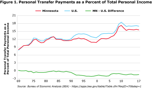
Transfer payments accounted for 15.6 percent of personal income in Minnesota in 2017 compared to 17.0 percent nationally. The 15.6 percent is down from a Minnesota high of 17.0 percent in 2010 (Figure 1). The recent drop in transfer payments as a percent of personal income repeats the usual cycle seen around recessions in Minnesota and nationally. When the economy stalls, growth in wages and salaries stalls or declines, while some transfer payments programs which are designed to be automatic stabilizers (increase when a recession hits and decrease when recovery starts), kick in.

Many programs comprising transfer payments are means-tested programs where qualifying for benefits depends on income level. Medicaid, Temporary Assistance for Needy Families (TANF), Pell Grants, and Earned Income Tax Credits (EITC) are means-tested transfer payments. Two of the three largest transfer payments, however, are not means-tested but age-tested. The two transfer payments, Social Security and Medicaid, accounted for 55.7 and 56.7 percent of all current personal transfer payments in 2017 in Minnesota and the U.S., respectively.
The Minnesota Personal Current Transfer Payments table lists the 16 types of transfer payment groups that the BEA compiles annually. The four smallest transfer payments listed by the BEA have been combined into an All Other category for this article. The Payment Descriptions column provides insight into the variety of benefits included in transfer payments. Some transfer payments are received directly by recipients as cash, like Social Security benefits, EITC payments, workers' compensation or unemployment insurance benefits. Other transfer payments are paid directly to providers of goods and services received by individuals. Payments that health care providers receive from Medicare and Medicaid are obvious examples.
| Minnesota Personal Current Transfer Payments | ||
|---|---|---|
| BEA Categories | $ Billions | Payment Descriptions |
| Personal current transfer receipts | 47.4 | - |
| Current transfer receipts of individuals from governments | 46.0 | - |
| Retirement and disability insurance benefits | 16.4 | - |
| Social Security benefits | 16.0 | Monthly benefits received by retired workers and their dependents, disabled workers and their dependents, and survivors. |
| Excluding Social Security benefits* | 0.4 | Railroad retirement and disability benefits. Workers' compensation. Temporary disability benefits, black lung benefits and benefits from the Pension Benefit Guaranty Corporation. |
| Medical benefits | 21.9 | - |
| Medicare benefits | 10.4 | Federal government payments made directly or through intermediaries to vendors for care provided to individuals under the Medicare program. Medicare Prescription Drug Plan (Part D) payments are also included. |
| Public assistance medical care benefits | 11.4 | Payments made directly or through intermediaries to vendors for care provided to low-income individuals or disabled under the federally assisted state-administered Medicaid program, and the Title XIX Medicaid expansion portion of the Children's Health Insurance Program (CHIP). |
| Military medical insurance benefits* | 0.1 | Vendor payments made under the TRICARE Management program for medical care of dependents of active duty military personnel and of retired military personnel and their dependents at nonmilitary medical facilities. |
| Income maintenance benefits | 4.2 | - |
| Supplemental Security Income (SSI) benefits | 0.8 | Benefits received by low-income persons who are aged, blind, or disabled from both the federal and state governments. |
| Earned Income Tax Credit (EITC) | 0.8 | Refundable federal income tax credit for low-income workers, mainly those who have minor children. |
| Supplemental Nutrition Assistance Program (SNAP) | 0.6 | Benefits issued to qualifying low-income households to supplement their ability to purchase food. |
| Other income maintenance benefits | 2.0 | Benefits received by low-income families under the Temporary Assistance to Needy Families (TANF) program. Other benefits included here are foster care adoption assistance, child tax credit, energy assistance, and the value of vouchers issued under Special Supplemental Nutrition for Women, Infants, and Children (WIC) program. |
| Unemployment insurance compensation | 0.8 | - |
| State unemployment insurance compensation | 0.7 | Compensation received by individuals under state-administered unemployment insurance (UI) programs. |
| Excluding state unemployment insurance compensation* | 0.0 | Other unemployment compensation payments to unemployed federal workers, unemployed railroad workers, and unemployed veterans who have recently separated from military service. Also trade adjustment assistance for workers who are unemployed due to international trade arrangements. |
| Veterans benefits | 1.4 | Veterans pension and disability benefits. Veterans readjustment benefits and veterans life insurance benefits. |
| Education and training assistance | 1.1 | Largely federal fellowship payments (National Science Foundation fellowships), interest subsidy on higher education loans, Pell grants, Job Corps payments, education exchange payments and state education assistance payments. |
| Other transfer receipts of individuals from governments* | 0.3 | Long list of programs including compensation for survivors of public safety officer killed on duty, compensation of victims of crime, Alaska Permanent Fund benefits, disaster relief benefits, and Bureau of Indian Affairs benefits. |
| Current transfer receipts of nonprofit institutions | 0.7 | Mainly receipts of private education institutions on behalf of the recipients of federal fellowships, Pell grants, and other education and training programs. State and local government payments to private nonprofit institutions that provide job training under a work-study program. Donation by corporate business to nonprofit institutions serving households. |
| Current transfer receipts of individuals from businesses | 0.6 | Mostly consist of receipts from insurance companies (commercial automobile liability, medical malpractice, and net insurance settlements) to individuals. |
| *Four of the smaller BEA categories of transfer payments have been combined in the All Other category used in Figure 2. | ||
Figure 1 shows the upward drift of transfer payments as a source of personal income as measured by the BEA over the last two decades. The aging of the U.S. population is an important element of the upward drift but so is expansion of transfer payment programs. For example, the Medicare prescription drug benefit (Medicare Part D) was initiated in 2006. In 2010 the Affordable Care Act (ACA), more commonly called Obamacare, expanded public health care assistance. Climbing transfer payments isn't just a recent development as various programs have been added over the last eight decades.
Table 2 shows transfer payments as a percent of personal income for each decade since the 1930s. Transfer payments accounted for less than 1.5 percent of personal income in Minnesota and the U.S. before the Great Depression. New Deal programs established during the Great Depression more than doubled the percent of personal income received via transfer payments during the 1930s. Transfer payments' share of personal income gradually increased in the 40s, 50s and 60s, before expanding significantly during the 70s and has continued to steadily climb since.
| Table 2. Transfer Payments as a Percent of Personal Income* | ||
|---|---|---|
| Year | U.S. | Minnesota |
| 1930 | 3.3 | 3.9 |
| 1940 | 3.7 | 4.2 |
| 1950 | 5.1 | 5.5 |
| 1960 | 6.8 | 7.4 |
| 1970 | 10.8 | 10.5 |
| 1980 | 12.2 | 12.0 |
| 1990 | 13.5 | 11.8 |
| 2000 | 14.5 | 12.9 |
| 2010 | 17.3 | 15.9 |
| *Decade average except for 2010 which is annual average from 2010 to 2017. | ||
| Source: Bureau of Economic Analysis (BEA) | ||
Transfer payments are mainly funded through federal spending, but state and local government spending on transfer payment programs is also included. For example, unemployment insurance benefits are a federal-state cooperative program with some states boosting unemployment checks above federally mandated levels. Many other federally run programs are augmented in some states through state spending that provides higher benefits than in other states. Annual Permanent Fund checks mailed out yearly to Alaskans are even included in the BEA's Other Transfer Receipts of Individuals from Governments category.
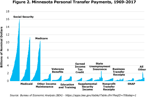
Figure 2 shows the increase in transfer payments by type. Social Security payments exceeded combined Medicaid and Medicare payments in Minnesota until 2000. The increasing cost of health care combined with the increasing age of Minnesotans and expansion of low-income health care programs has pushed combined Medicaid and Medicare payments to $21.4 billion in 2017 in Minnesota. That is roughly 36 percent more than the $16.0 billion in Social Security benefits collected by Minnesotans in 2017. Only three states – South Dakota, Idaho and Wyoming – received more Social Security payments than combined Medicaid and Medicare payments in 2017.
Figure 2 provides a visual check on the size of various transfer payments. For example, Minnesota's Unemployment Insurance Program paid out $700 million in 2017, which was only 5 percent of the $16 billion Minnesotans collected in Social Security that year. The $700 million in unemployment checks was equivalent to roughly 0.4 percent of wages and salaries and self-employed income (earnings from work) earned by Minnesotans in 2017. Unemployment insurance benefits topped $2.5 billion in 2009 during the worst of the last recession, the equivalent of 1.8 percent of the work-related earnings in 2009.

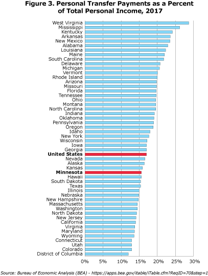
Minnesota has received a smaller share of its personal income from transfer payments than the U.S. continuously since 1984 as shown in Figure 1. The state reached its biggest gap relative to the nation in percent of personal income arising from transfer payments in 1996. The state ranked 19th lowest in 2017 when it comes to personal transfer payments as a percent of personal income (Figure 3). West Virginia with its high rate of poverty and one of the oldest populations topped the list as the most transfer payment-dependent state. Other states with high transfer payments dependency have similar characteristics when it comes to poverty, age structure, low wages, low labor force participation rates and relatively high unemployment rates.

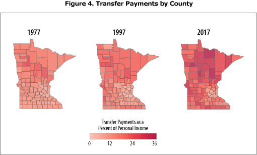
While transfer payments made up 15.6 percent of personal income in Minnesota in 2017, the percent across counties ranges from 7.8 percent in Carver County to 35.2 percent in Mahnomen County. Only nine counties depend on transfer payments for a lower share of their personal income than the state average. All but one of the nine counties – Olmsted County, home to Rochester – are in the Minneapolis-St. Paul MSA. Twenty percent or more of personal income arose from transfer payments in 55 of the 87 counties in Minnesota. The share of personal income accounted for by transfer payments was 13.9 percent in the metropolitan portion (27 counties) of the state and 23.6 percent in the nonmetropolitan portion (60 counties).
Figure 4 shows the dependency of counties on transfer payments through the last four decades. While transfer payments as a percent of personal income have nearly doubled statewide since 1969, they have more than doubled as a percent of personal income in 62 Minnesota counties. The growth in transfer payments across counties can be explained by many of the same variables that determine transfer payment variation across states: poverty rates, age structure, low wages, low labor force participation rates, stagnate job growth, and high unemployment rates. Higher rates of transfer payments, by design, are mostly symptoms of sluggish local economies, not causes.

In some cases, increasing transfer payment dependency may actually be a sign of strength. That may be the case in counties where retirees are moving to. Seven of the top 15 counties in terms of increasing reliance on Social Security income between 2007 and 2017 are prime Minnesota lake counties. Increasing Social Security payments in these counties (Cass, Cook, Crow Wing, Itasca, Kanabec, Koochiching, and Lake) is probably the result of net immigration by retires in addition to the aging of native county residents. Getting to know the importance of transfer payments and ongoing changes in the mix of transfer payments in local areas is just another tool in understanding local economies.1
1A Tableau visualization of all 16 transfer payments categories data published by the BEA for 1969 through 2017 for Minnesota and all 87 counties. Transfer payment data are displayed on a per capita, percent of state transfer payments, percent of county transfer payments, and percent of county personal income basis as well as the actual detailed annual transfer payment amounts.